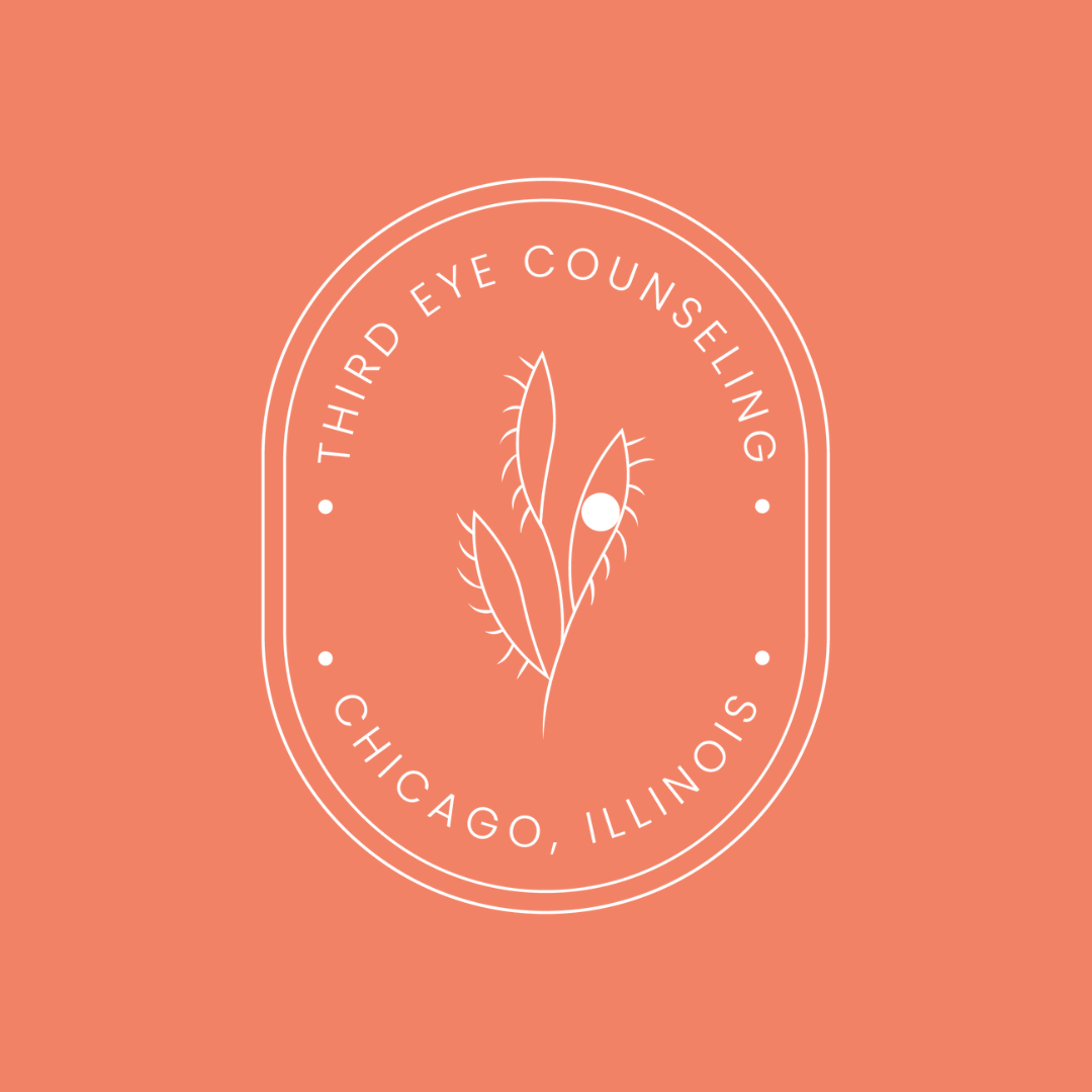
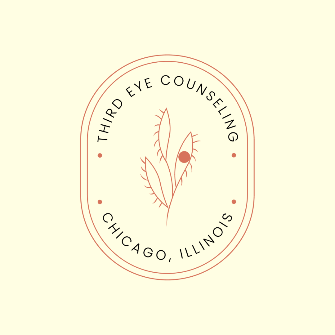
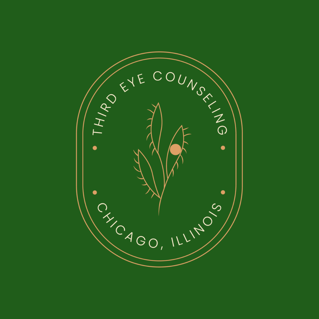
THIRD EYE COUNSELING
This client came to me looking for a personal brand for her growing therapy practice. She wasn’t interested in something like the boring therapy logos she saw out there. She wasn’t afraid of color, and wanted to make sure her brand conveyed warmth while steering clear of all the typical therapist imagery.
We worked together to create an emblematic stamp of a logo that works on all graphics and the website. It alludes to a third eye without feeling too cosmic. It’s elevated and luxe but not overdone.
MUST-HAVES: Clean, grounded, and modern layout, elevated and luxe feel without being overdone, minimalist design with high-end sensibility, breathable and elegant
DELIVERABLES: Logo, brand colors, website
"Ruby was so collaborative and supportive in my practice's logo redesign. Ruby is like an alchemist, taking my very abstract, vibe-based descriptions and translating them to a visual that genuinely fits. She somehow understood exactly what I was hoping for and created something better than I imagined!" —Client