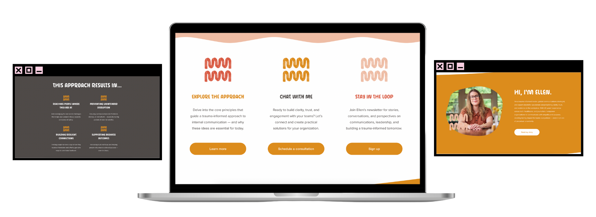
EQUILIBRIOUS COMMUNICATIONS
This client came to me looking for a personal brand for their trauma-informed consulting business. We talked about favorite artists (Corita Kent and Joan Mitchell) as influences, and favorite colors. This one came together within a few revisions. The logo mark adds texture to images or can act as an icon. The palette is bright but grounded, allowing for an accessible and enjoyable website.
MUST-HAVES: Southwest color palette, adaptable logo mark, interesting font
DELIVERABLES: Logo, brand book, website
“I keep peeking back and looking at this. I'm so . . . amazed. This is exactly — no, better than — what I dreamed of. Thank you.”
—Client